
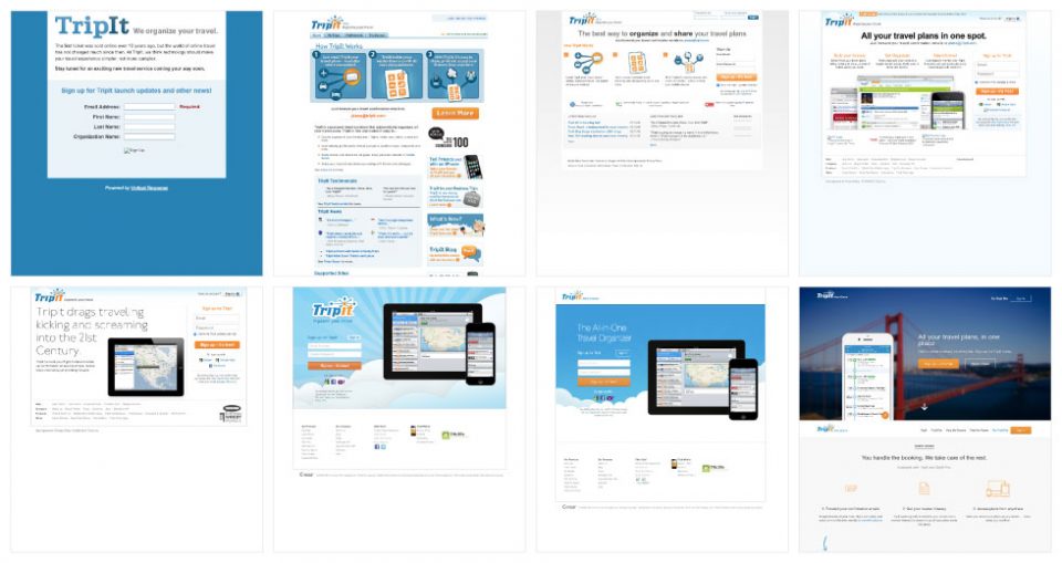
If you haven’t seen it yet, big changes are happening on TripIt.com. Our team has been working diligently over the last year to give TripIt.com a much-needed redesign, as well as to rethink our aging visual brand.
In the world of apps, having a birthdate of 2006 makes us practically a dinosaur. As a team who cares so deeply about our product and our users, we recognized that it was time to face the realities of a mature brand.
Over the last 12 years as our product has evolved, and the needs of our travelers have changed, so has our brand (as you can see below). We felt that the time had come for the TripIt brand to evolve and grow once again.
We couldn’t put a Band-Aid on this, it was time to take this head-on.
 For a change as dramatic as this, we thought it would be good to pull the curtain back and give you some insight into what influenced us and why we made the decisions we did.
We are so incredibly excited to share our new website, and with it, a new chapter for our brand.
For a change as dramatic as this, we thought it would be good to pull the curtain back and give you some insight into what influenced us and why we made the decisions we did.
We are so incredibly excited to share our new website, and with it, a new chapter for our brand.
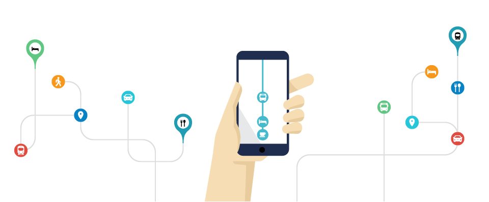 With this example, we’re able to show how TripIt can break through the chaos of organizing your travel plans and neatly organize them in one place. TripIt has much more to offer, but how we organize and simplify travel is an important first step.
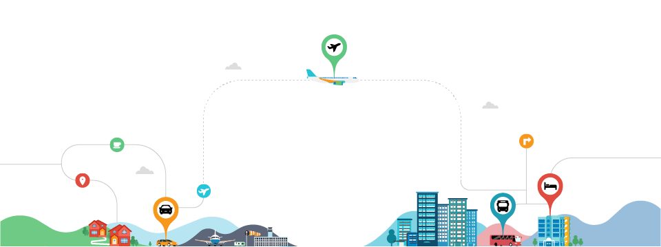 We wanted a creative way to show how TripIt has you covered at every stage of your trip—from planning to landing. It was important to us to show the whole picture, instead of just dealing with individual situations during a trip.
 Even though we wanted to pull back and show you the bigger picture, we also wanted to be able to pull in close and show certain situations where travelers experience the “magic” — be it preparing for a trip, catching a taxi or navigating through an airport.
 The design for our previous app icon was inconsistent as well as not properly optimized for the variety of mobile devices that one can use to access TripIt, including Apple Watch, iMessage and Android. With this redesign, we wanted to retain the memorable brand colors (the orange, white, blue combination) while also taking an updated approach to our TripIt atom that has been a fixture of our brand identity from the beginning.
It is our hope that all of these changes provide you and future users of TripIt with a more consistent experience while better representing our brand, our product and our people.
The design for our previous app icon was inconsistent as well as not properly optimized for the variety of mobile devices that one can use to access TripIt, including Apple Watch, iMessage and Android. With this redesign, we wanted to retain the memorable brand colors (the orange, white, blue combination) while also taking an updated approach to our TripIt atom that has been a fixture of our brand identity from the beginning.
It is our hope that all of these changes provide you and future users of TripIt with a more consistent experience while better representing our brand, our product and our people.
For a change as dramatic as this, we thought it would be good to pull the curtain back and give you some insight into what influenced us and why we made the decisions we did.
We are so incredibly excited to share our new website, and with it, a new chapter for our brand.
Unpacking the Problem
When our team sat down to rethink our website, we quickly realized we had more to fix than just woefully out-of-date content and visuals:
Difficulty Keeping Up with the Times
TripIt has continuously found new ways to make travel easier for travelers. Unfortunately, our website had trouble keeping up with this pace of innovation and was still hanging out in 2013. Updating our website was also difficult and labor intensive, which led to having outdated product shots and messaging throughout.Not Reflective of Who We (and You) Are Today
As a part of a diverse company, with people from all walks of life and from all parts of the world, building a brand with inclusivity in mind is important to us. We want the TripIt brand to not only represent and connect with the people who use it, but for it to also be a representation of the people who work here. Something to demonstrate the pride that we all take in the work we do and the pride we take in our people.A Hodge-Podge of Visual Design and Web Experiences
Our website was a bit of a “Choose Your Own Adventure” experience, with pages full of features showcasing individual aspects of our product while failing to connect to the benefits of using TripIt before, during and after your trip. Like many brands, our site was also far too reliant on big stock photos and screenshots of our product. I love a great scenic shot of San Francisco as much as the next person, but it didn’t help communicate the value and benefits of TripIt in a clear and concise way. Resulting in a website slowed down by an overabundance of large imagery that felt impersonal and limiting.Arriving at a Solution
TripIt removes the clutter and confusion of travel—and gosh darn it—our website should do the same. To accomplish that, we knew we needed to clearly communicate the benefits of using TripIt first, then also help illustrate how our features help our users travel smarter. It was also important to us to show how TripIt Pro has you covered at every stage of your trip—from planning to landing—while keeping up with the pace of our evolving product. We saw an opportunity to use illustration—something our design team had honed over the years—to accomplish these goals while reflecting the diversity of our team and users. Illustration would provide us much more flexibility and creativity in how we visually communicate the benefits and functionality of TripIt. It would allow us to capture individual moments (receiving a flight alert, getting through security) as well as also be able to pull back and illustrate the complexity of a trip as a whole (all your travel plans, every stage of your trip).
With this example, we’re able to show how TripIt can break through the chaos of organizing your travel plans and neatly organize them in one place. TripIt has much more to offer, but how we organize and simplify travel is an important first step.
We wanted a creative way to show how TripIt has you covered at every stage of your trip—from planning to landing. It was important to us to show the whole picture, instead of just dealing with individual situations during a trip.
Even though we wanted to pull back and show you the bigger picture, we also wanted to be able to pull in close and show certain situations where travelers experience the “magic” — be it preparing for a trip, catching a taxi or navigating through an airport.